


Overview
A portion of my exhibit work was developing visual systems to support the entire exhibit. They needed to mesh with the existing exhibits and architecture to create a cohesive experience. Below are a few excerpts from my exhibit brand work.
MY ROLE
Senior Designer
EMPLOYER
HW Exhibits
PROJECT TYPE
Brand Development
DURATION
Approximately 1–2 weeks for each project

Aura Holistic Day Spa and Residence
Next Section: Interior Design


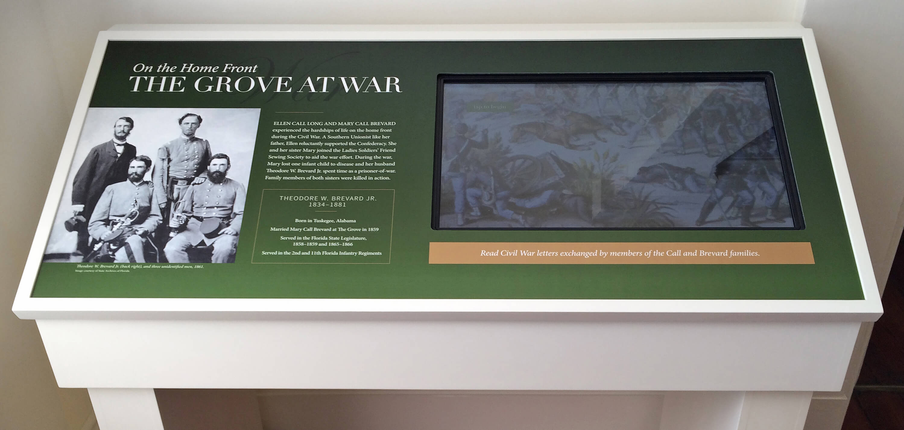
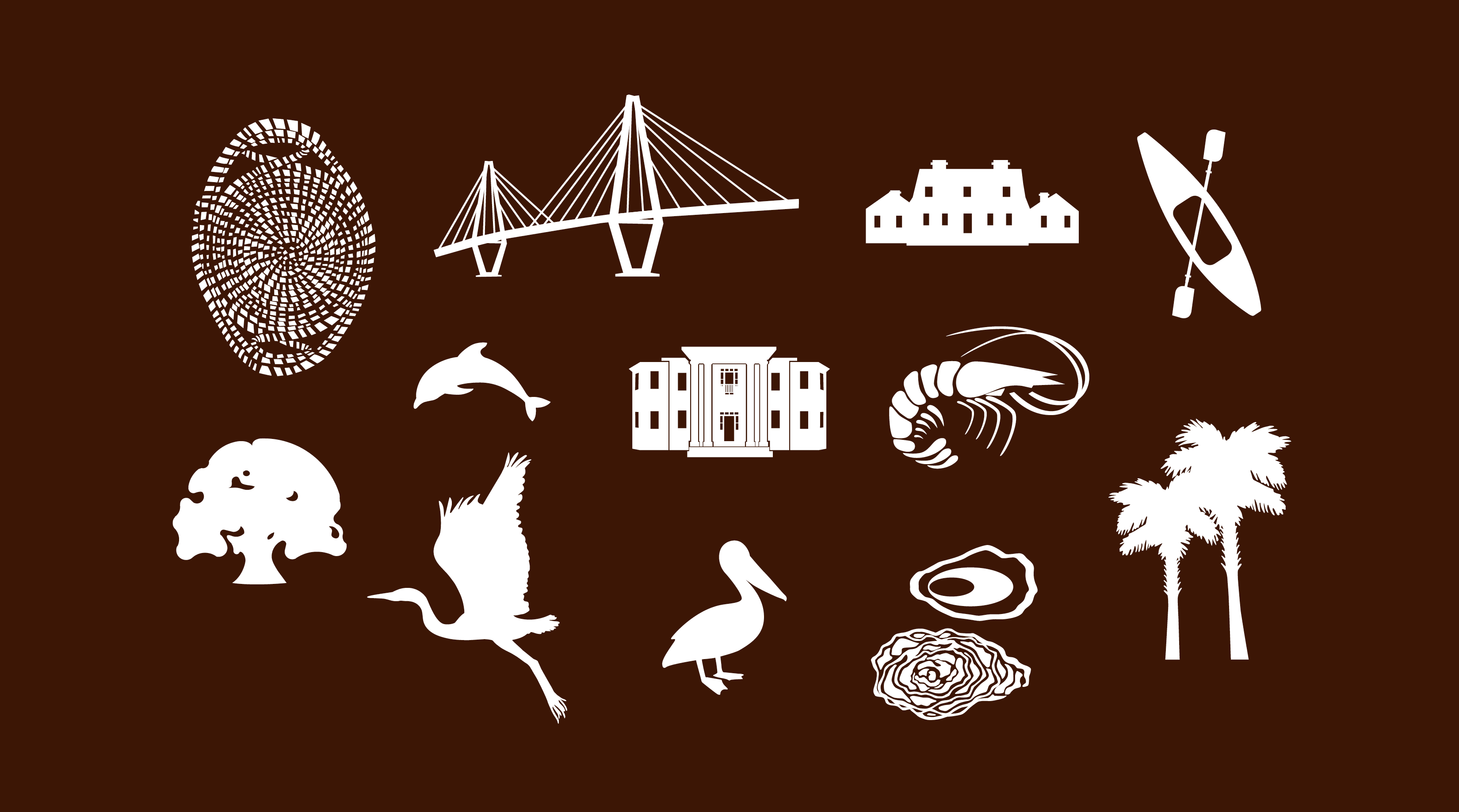
THE GROVE MUSEUM
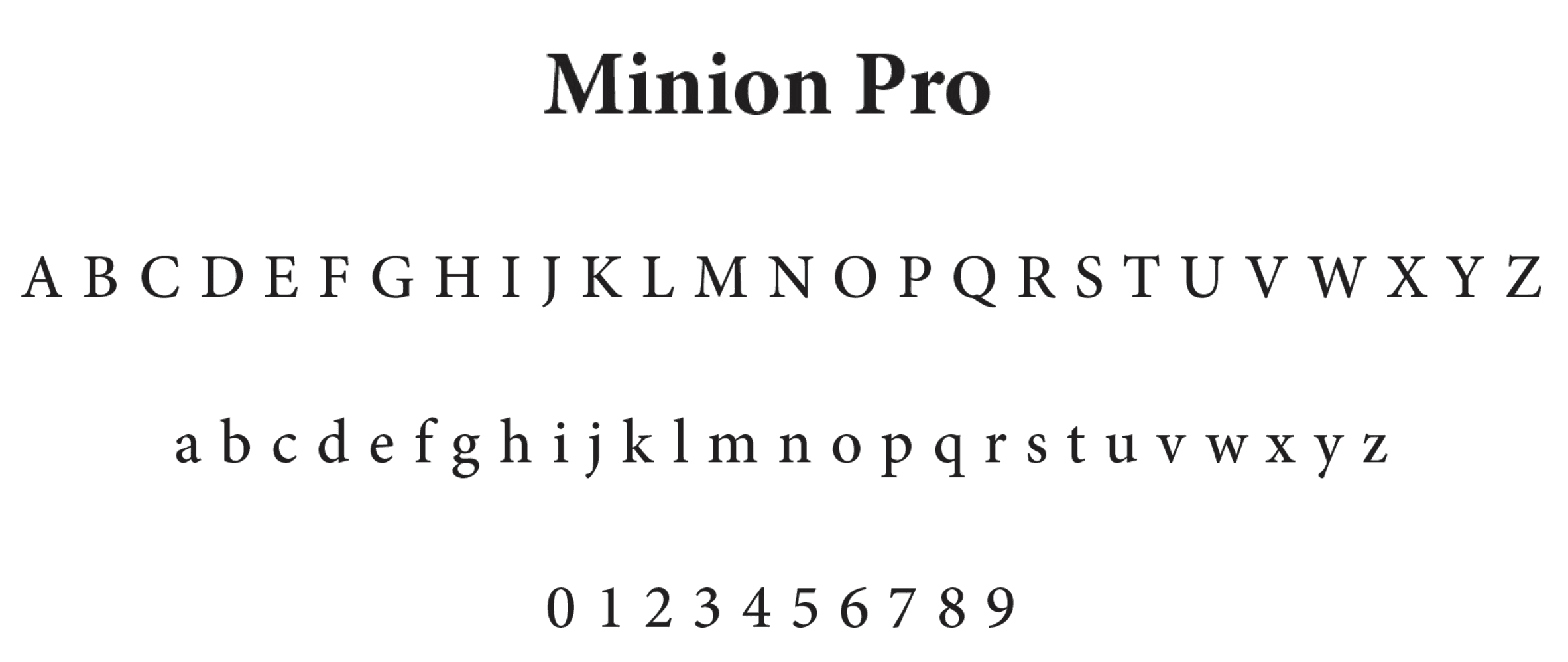
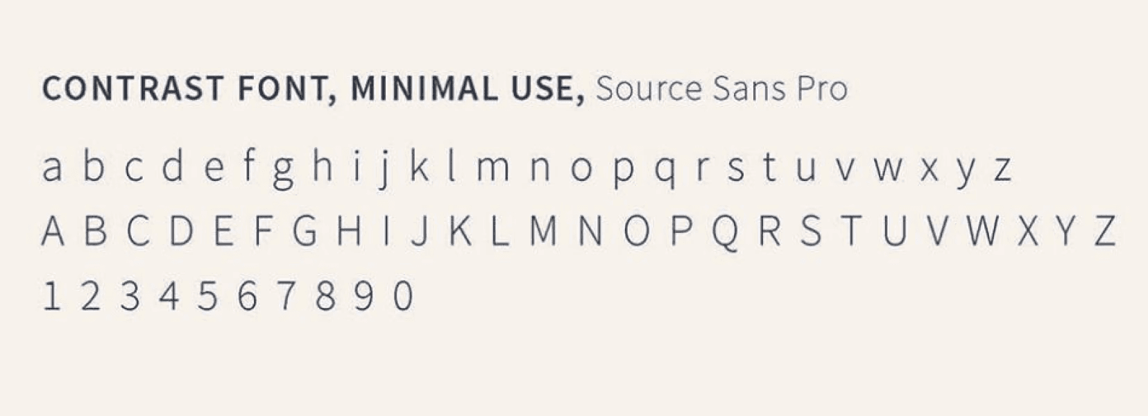
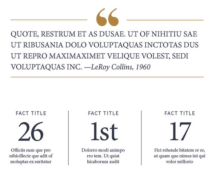
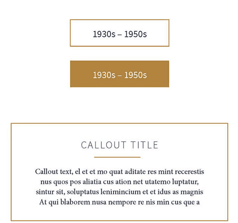
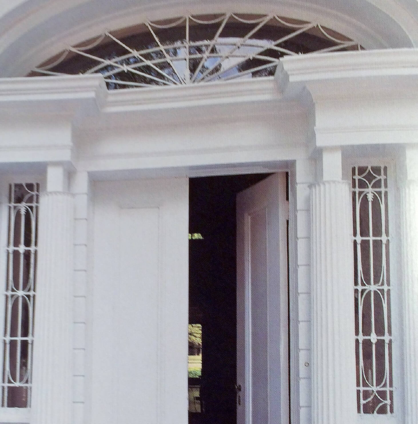
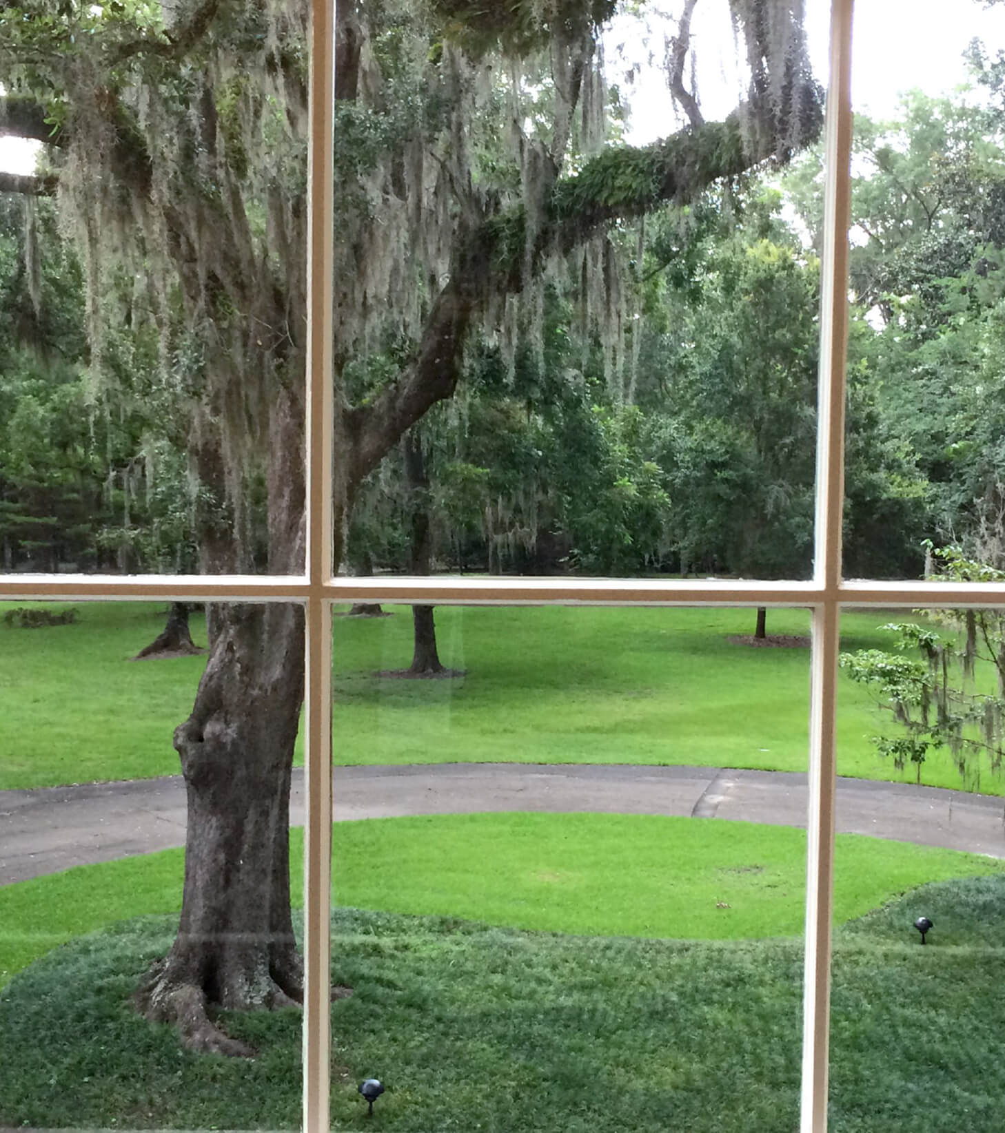
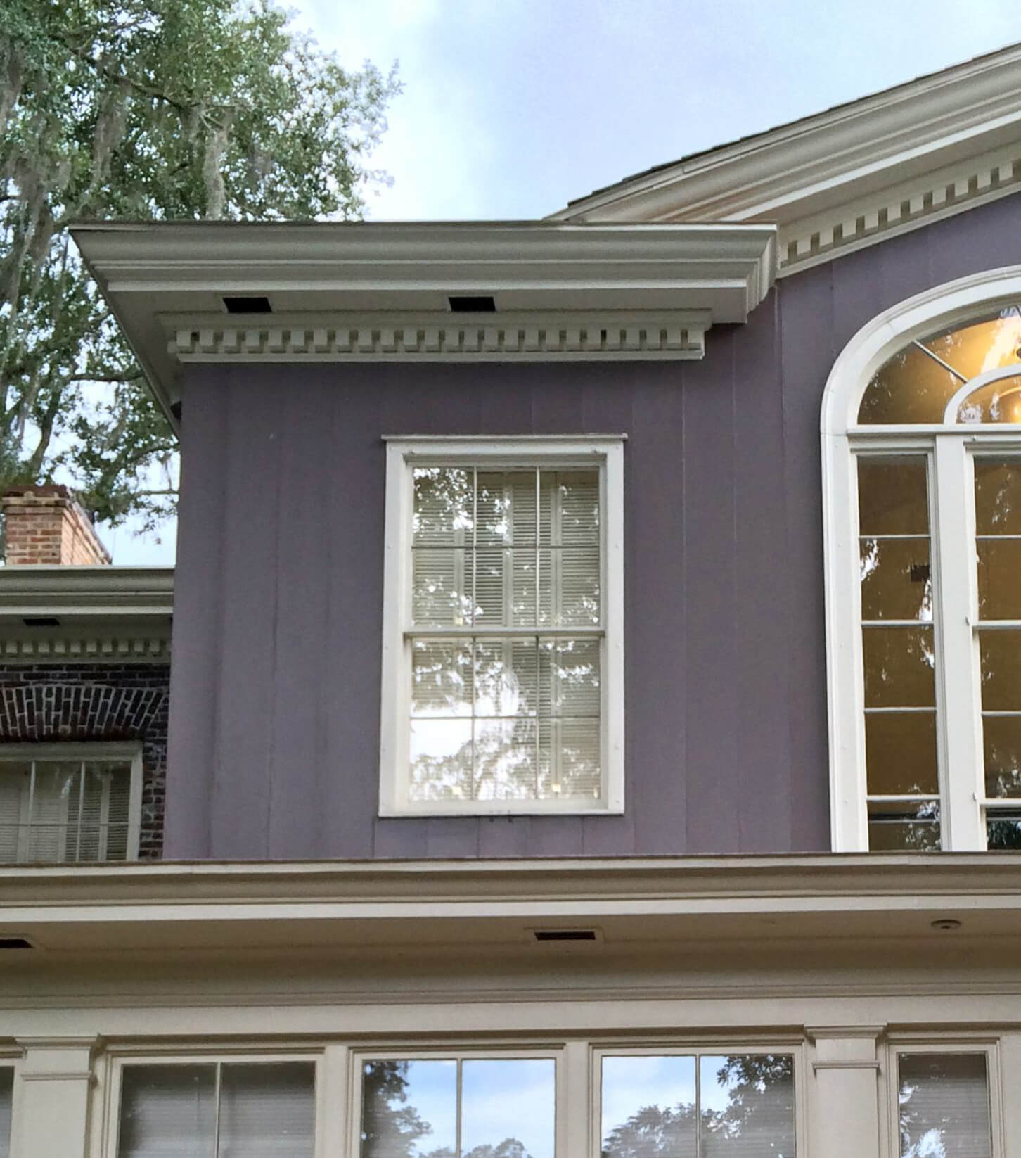
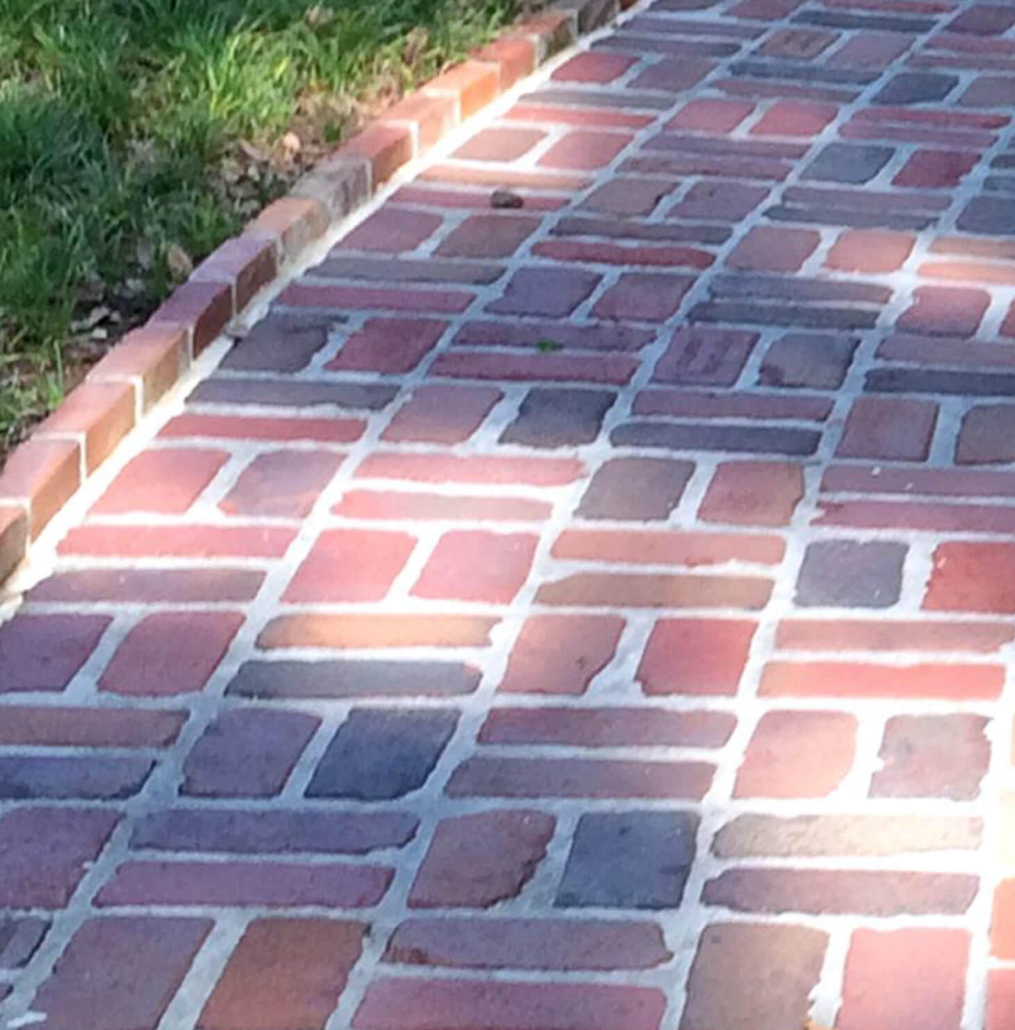
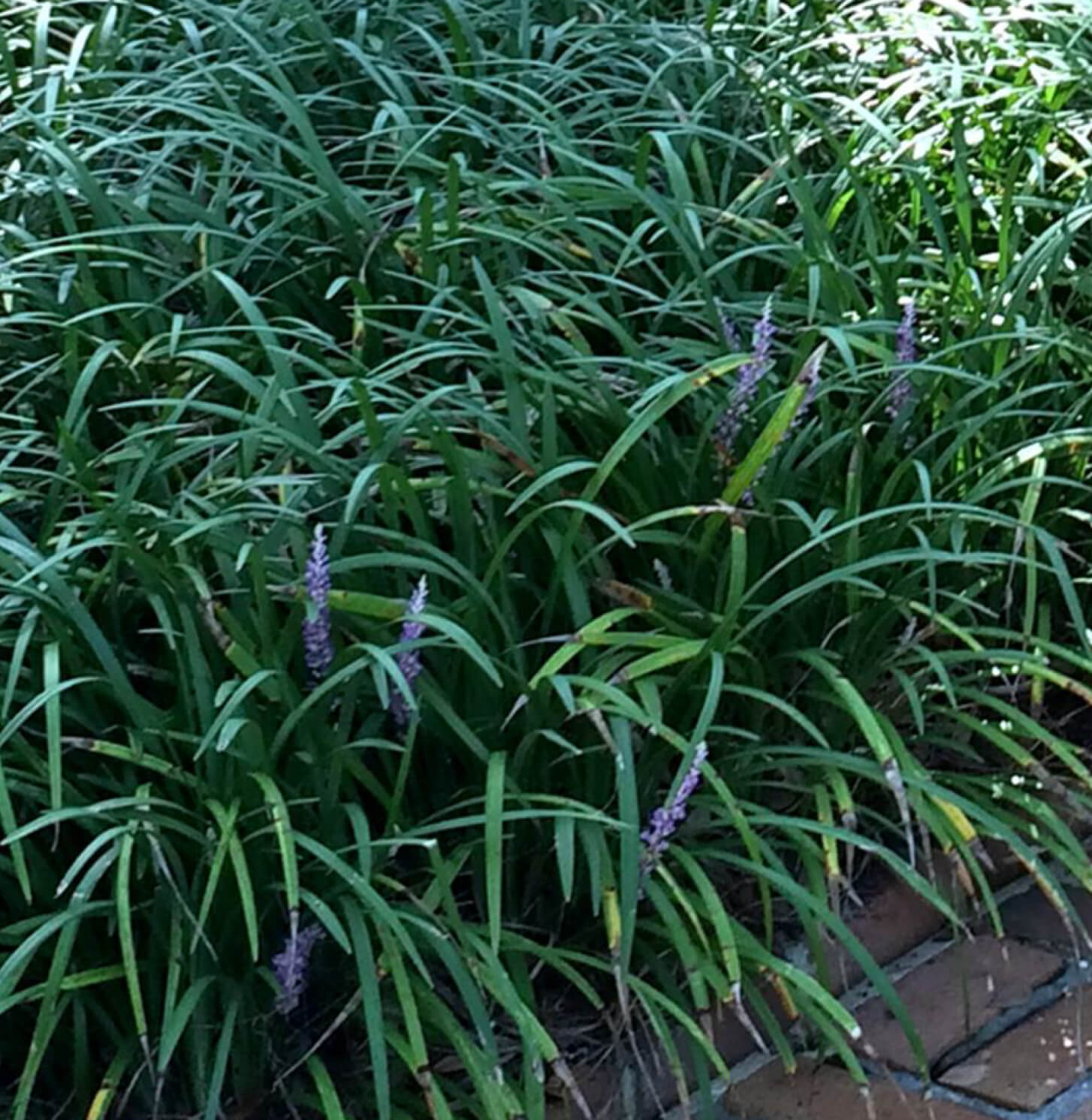
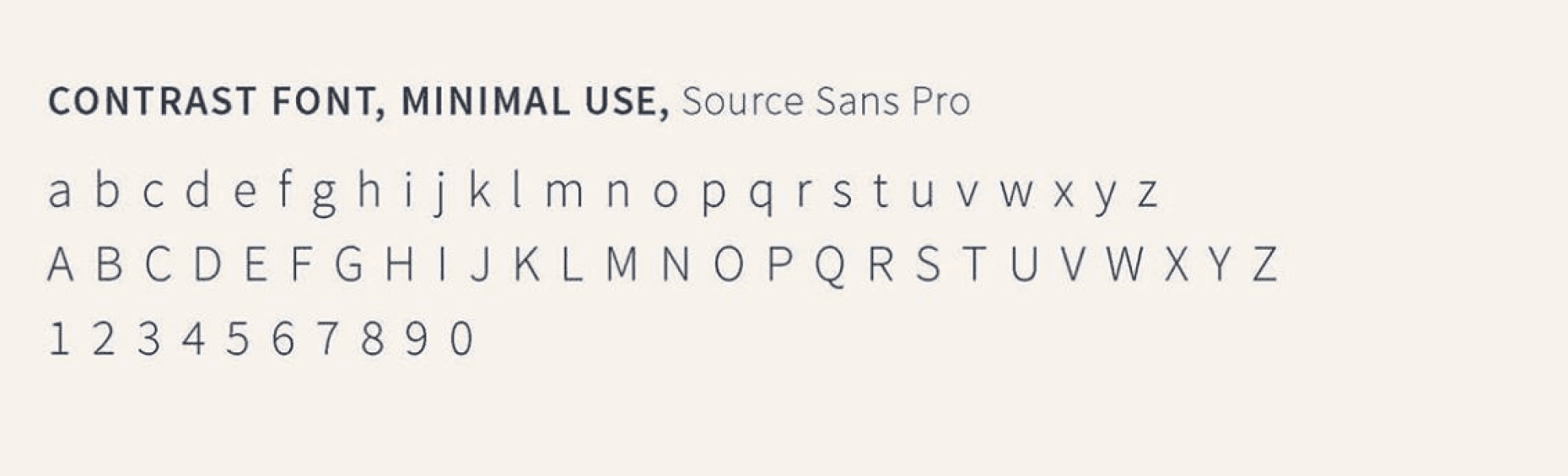
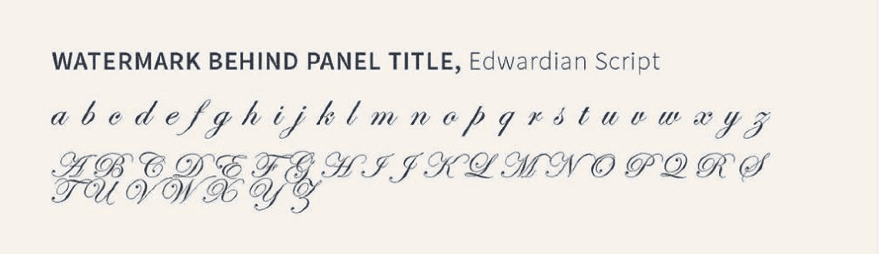
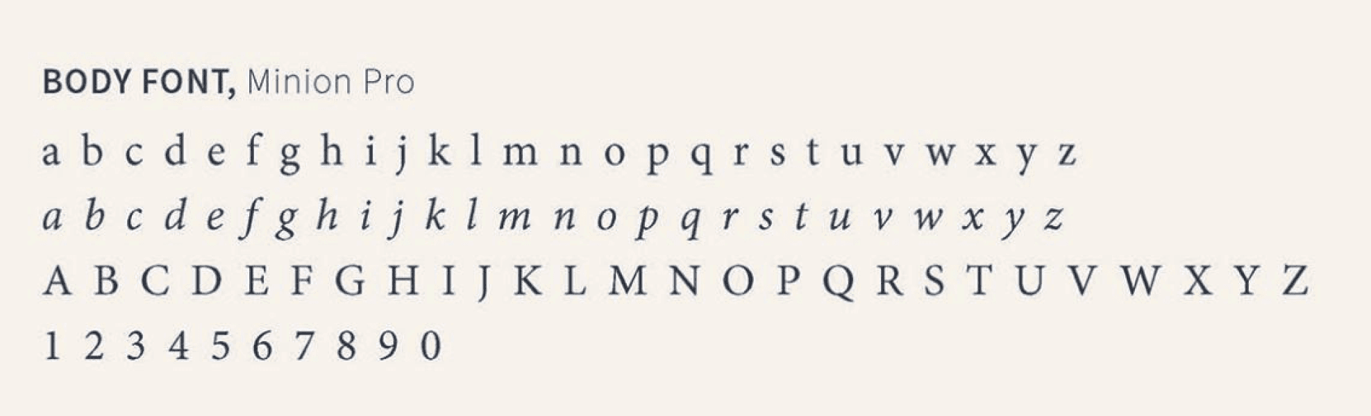
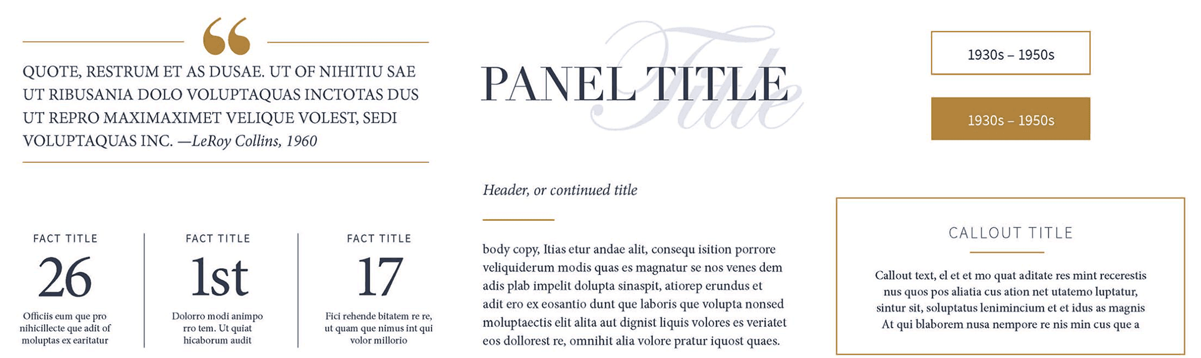
The brand for The Grove museum was inspired by its natural setting and historic architecture. I developed the brand from scratch to reflect The Grove's elegant simplicity, blending modern and timeless elements seamlessly. The design system translated to both print and digital platforms.
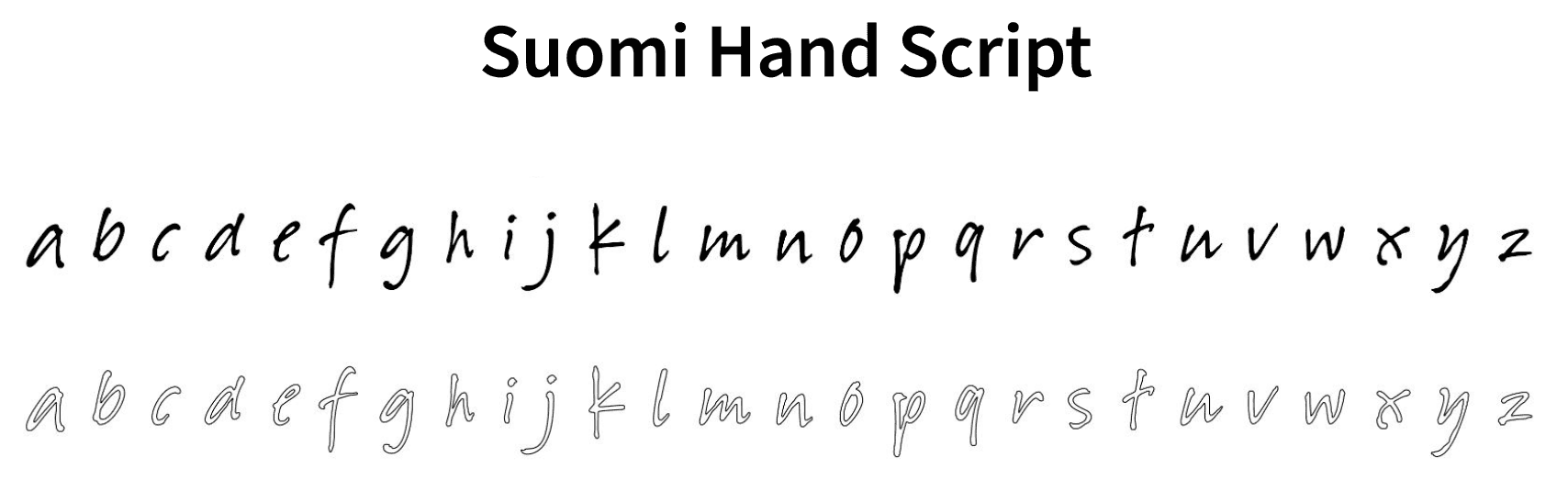
Typography
Color Palette
Design Elements
Icon Development


Brand Application
Inspiration
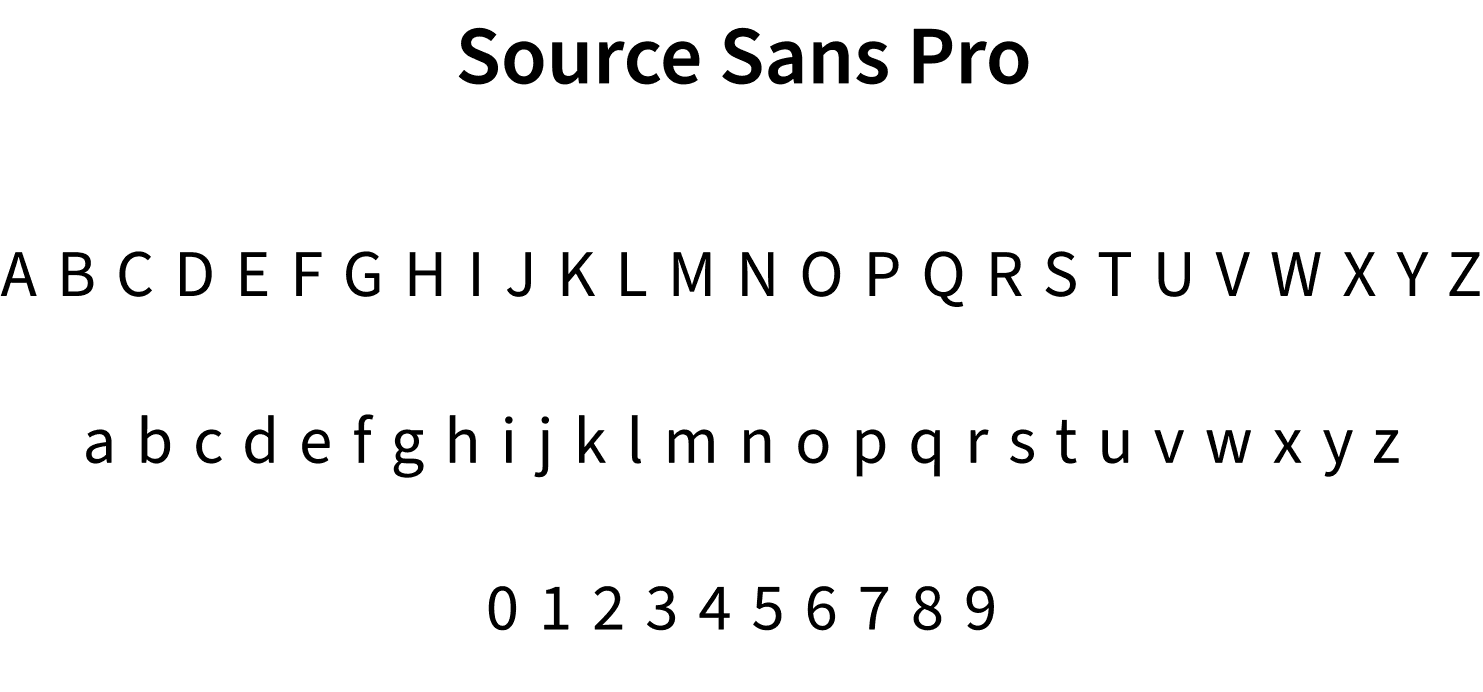
Typography
Color Palette
Photography
Voice
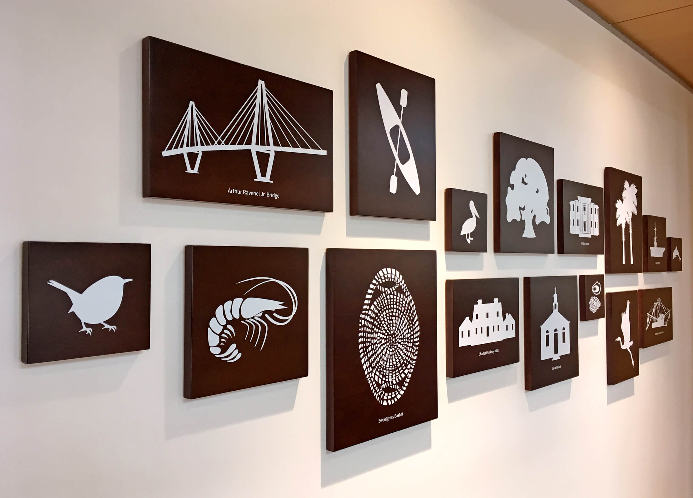
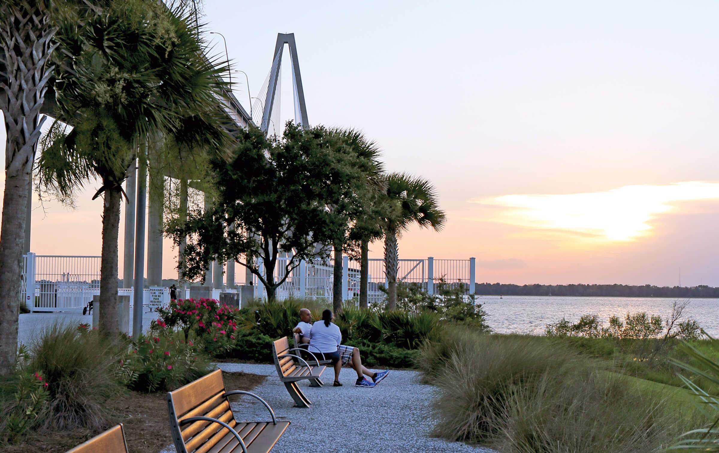
Mount Pleasant's new town hall was under construction when I began the exhibit design for the lobby. Interior design finishes and architectural details had already been selected for the space, so I used those as a guide to develop the design system for the exhibit. To complement the interior details, I choose wood grains, watery blues, timeless fonts, and pops of silver.
Our Town
Our Journey
Our Service
Our Heart

Inspiration
Brand Application
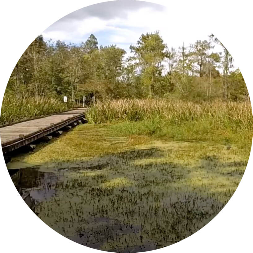
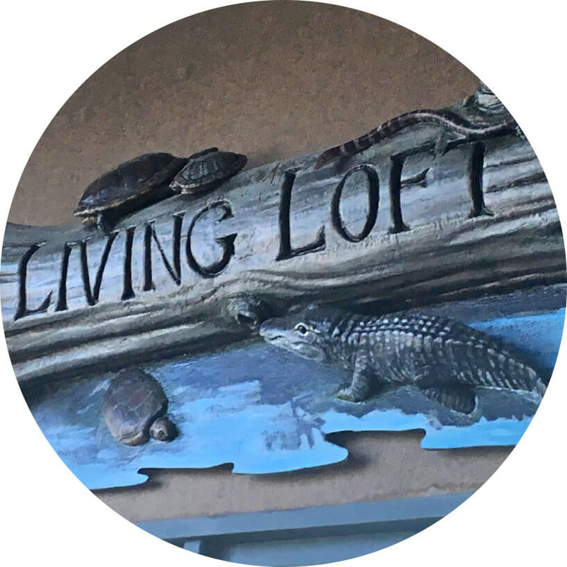
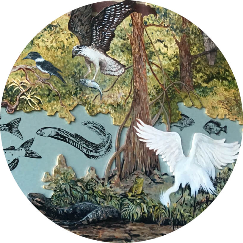
I designed the "Living Loft" space within the Old Santee Canal Park Interpretive Center. Although the center didn't have an established brand, it featured several existing exhibits. Drawing inspiration from those exhibits and the surrounding natural environment, I developed a cohesive visual experience that tied the space together.
To create an emotional connection with visitors, my teammates and I decided to use "our" verbiage in the exhibit, which functioned as the primary message for each exhibit panel.