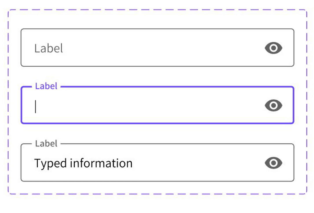
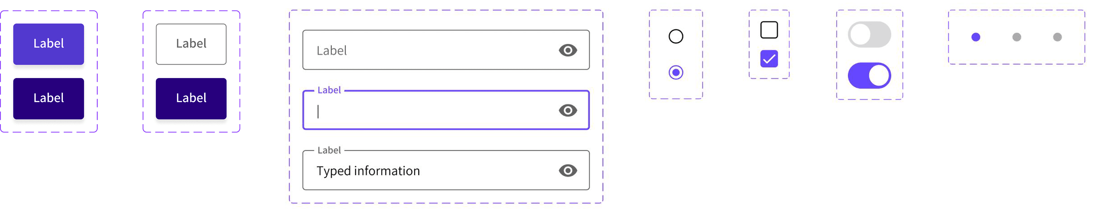
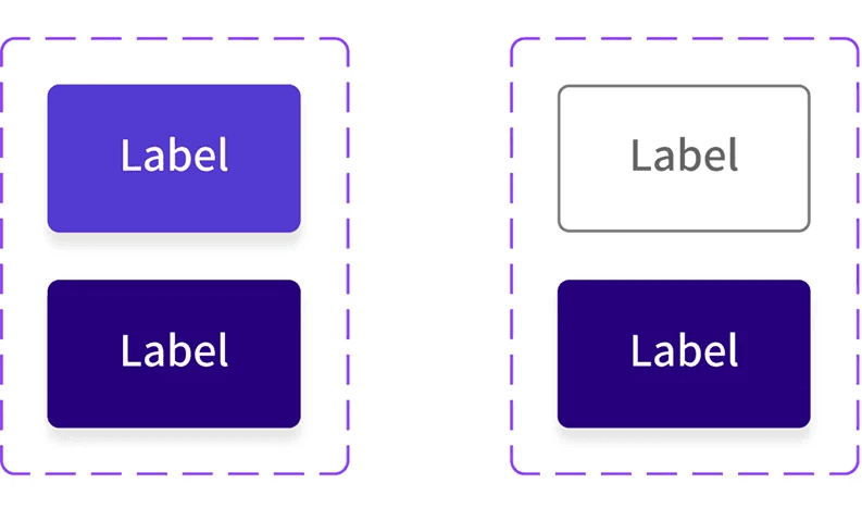
UI Elements
Secondary Buttons (outlined)
Overview
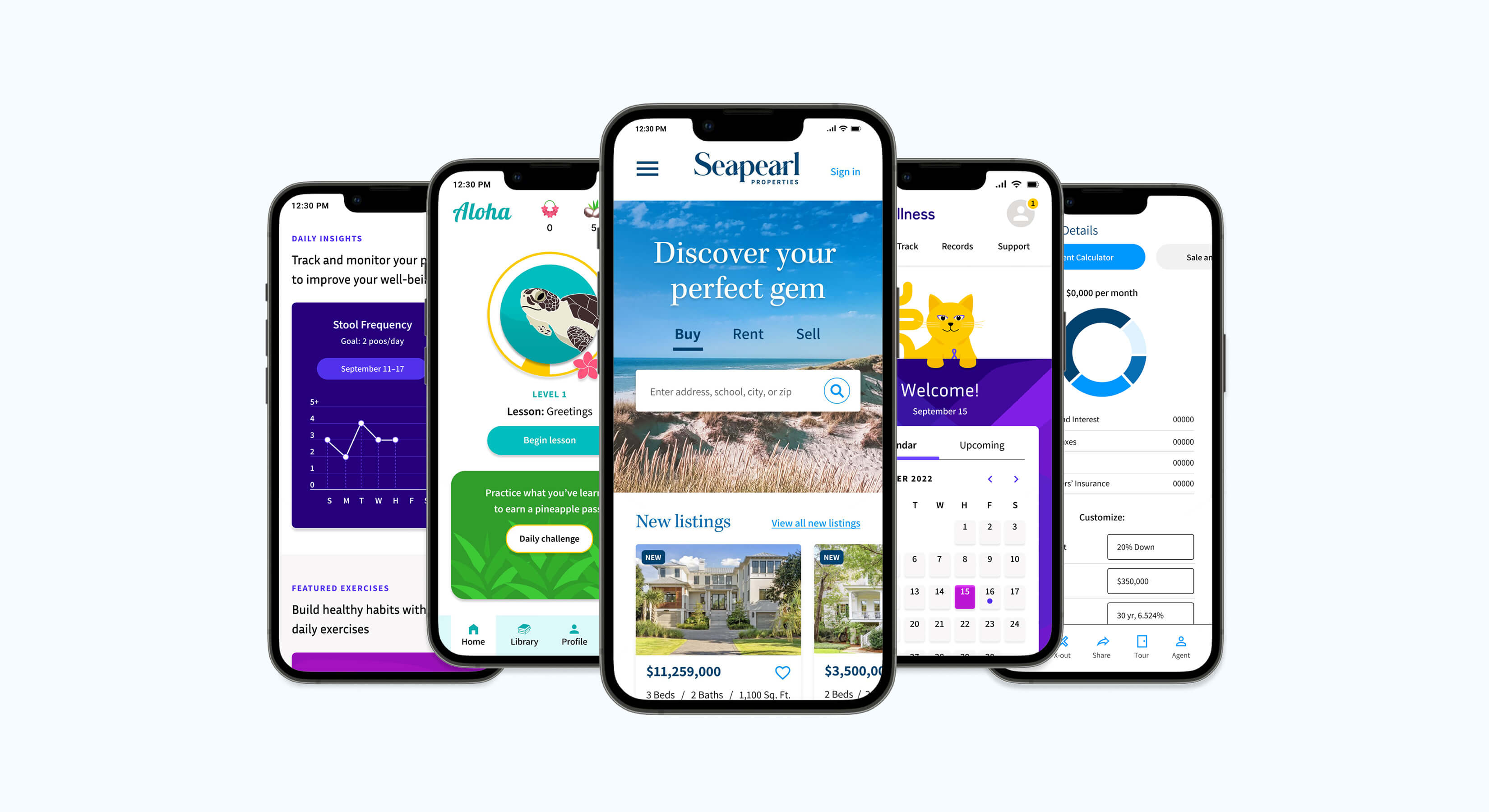
I developed visual identities, design systems, and style guides from scratch for my UX/UI projects, using data-driven research insights to guide my decisions. Design system excerpts are below for each project: Seapearl Properties, Aloha, and UC and Wellness.
DESIGNED FOR
UX/UI Immersive
PROJECT TYPE
Brand Development
DURATION
Approximately 2 weeks per project
UX/UI Design System Highlights
UX/UI Design System Highlights
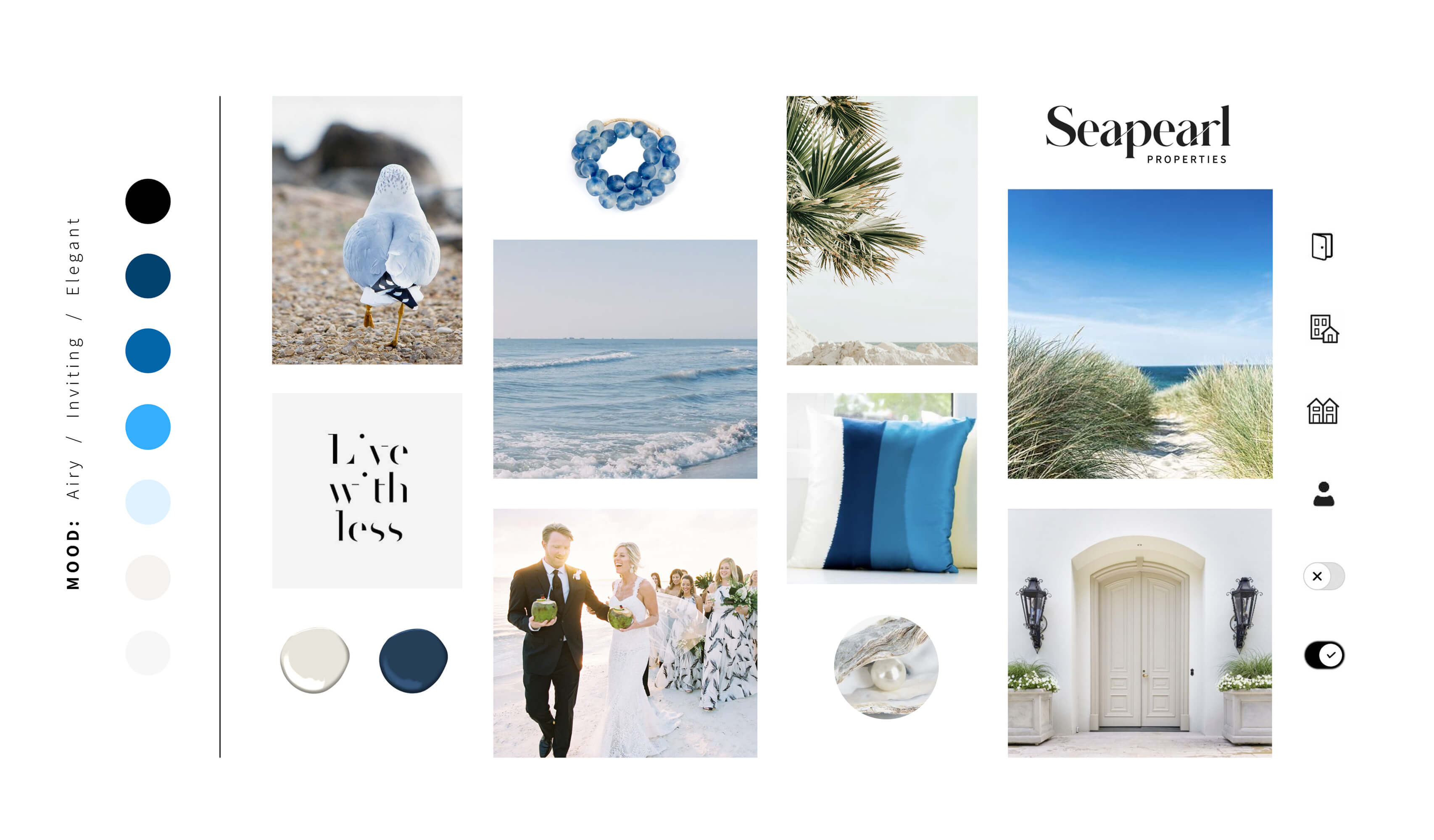
My first step was to gather online inspiration for creating the brand—images, fonts, icons, and colors that are reminiscent of the sea. The look I decided upon was airy, inviting, and elegant, which aligns with Seapearl Properties’ listings and clientele.
Mood Board
Color Palette
Secondary Buttons (outlined)
UI Elements
Dark Blue (default) / Hex #00426F
Logo Creation
Padding / Maintain at least 44px of padding
Iconography
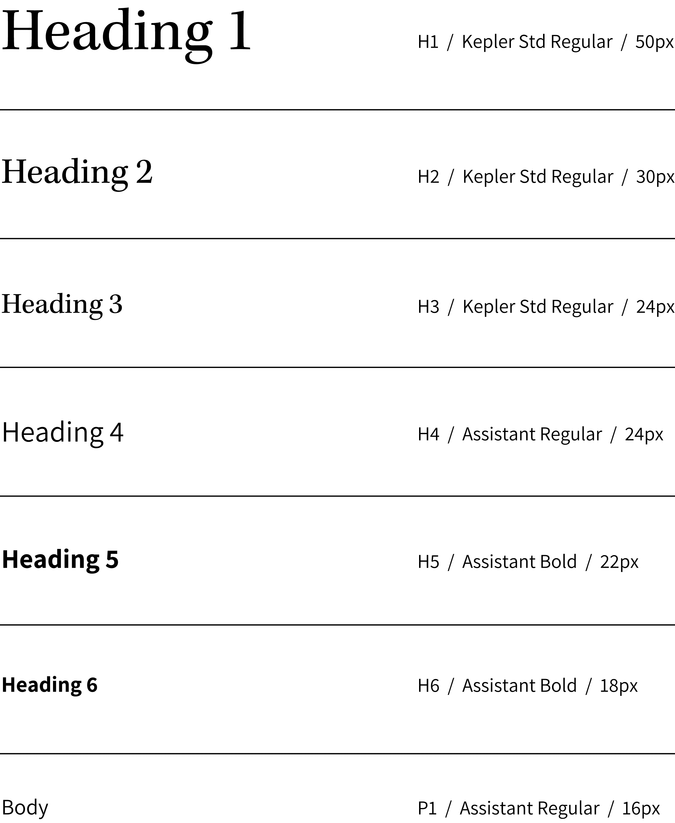
For the Seapearl Properties website, I created a scalable design system, including logo development and UI specifications. Excerpts from that process and the brand guidelines are below.
Grid for Icon Creation
UI Design Grids
Input Fields
Brand Application
Initial Color Palette
Color values and usage would need further review to ensure ADA compliance.
Logo and Typography
Game Icons
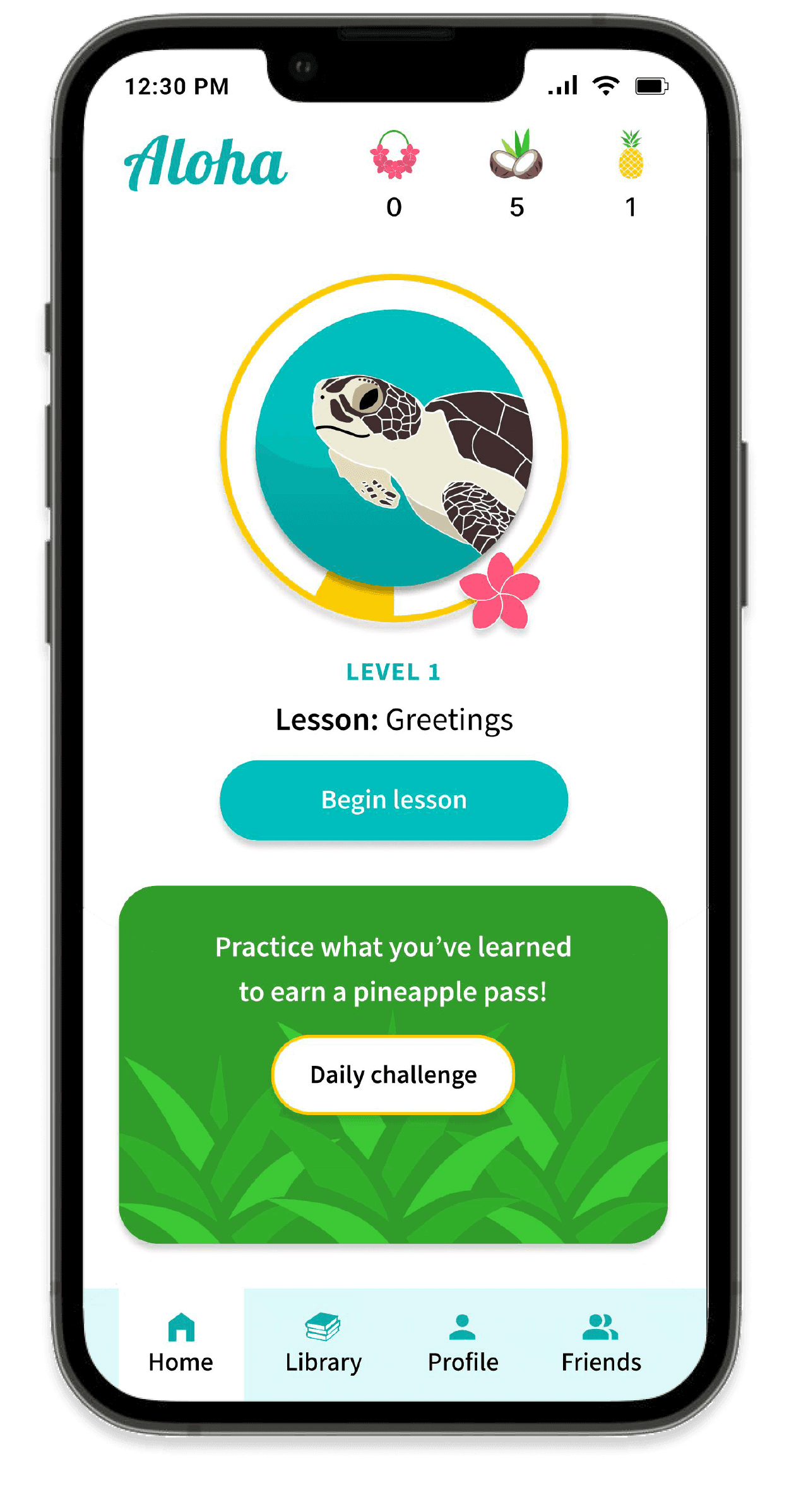
ALOHA APP
The color scheme of this Hawaiian Language learning app is fun, vibrant, and colorful, representing the lush, diverse beauty of the Hawaiian Islands. These were my initial brand concepts.
UC AND WELLNESS
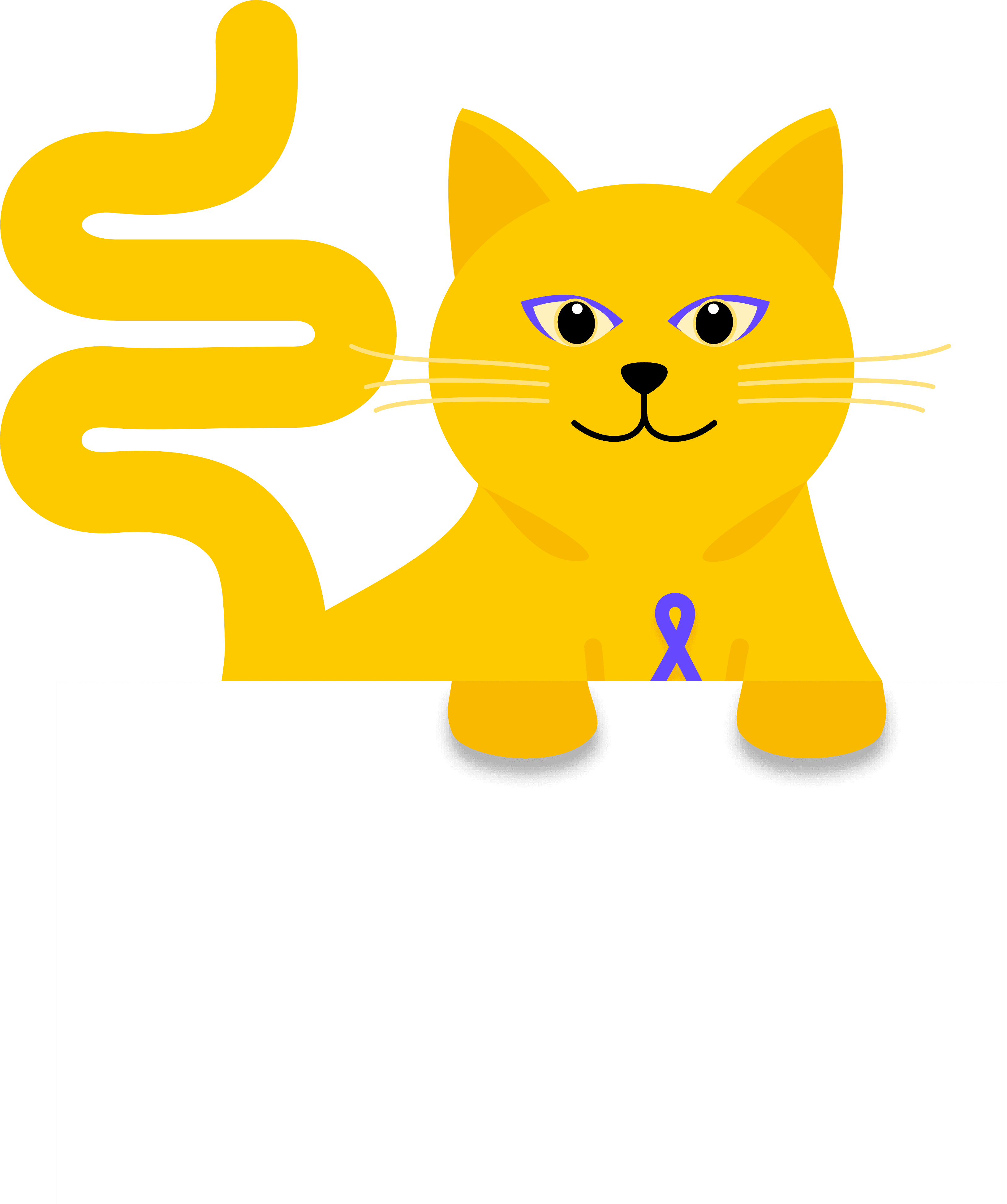
UC and Wellness is a platform focused on improving the wellbeing of those living with ulcerative colitis. To add a touch of warmth and humor to a serious subject, Coco the Colon Cat was introduced—an animated mascot created to connect with users in a compassionate and approachable way.
UC and Wellness is a platform focused on improving the wellbeing of those living with ulcerative colitis. To add a touch of warmth and humor to a serious subject, Coco the Colon Cat was introduced—an animated mascot created to connect with users
in a compassionate and approachable way.
Design Language System
Mission Statement
Logo
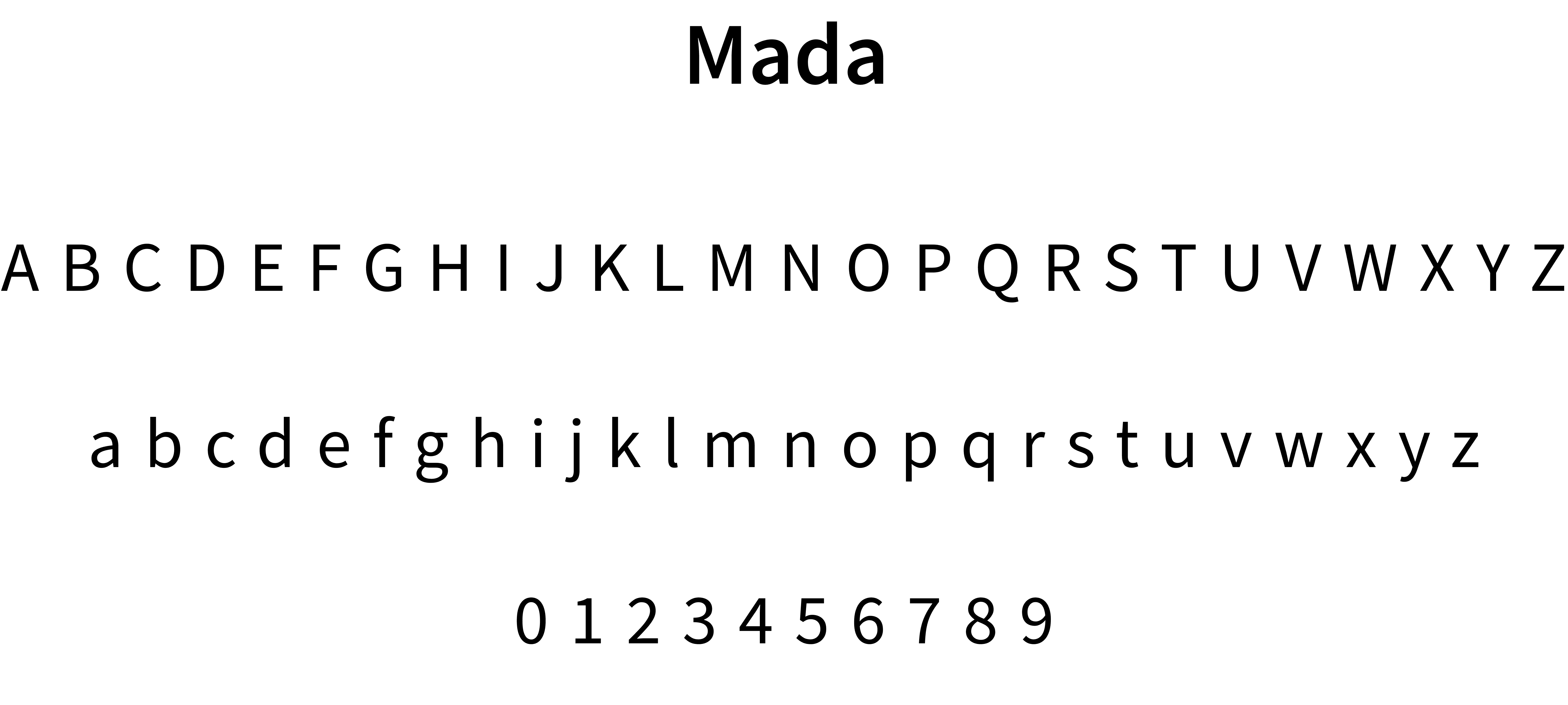
Typography
Colors
Grids
UI Components
Interactions
Animations
Tagline and Voice
Mascot
An excerpt from the design language system is displayed below.
Typography
Iconography
Common UI Components
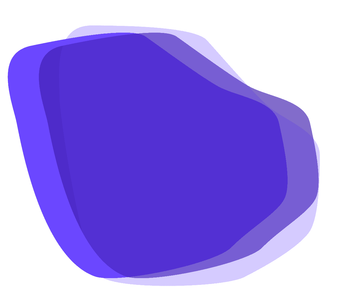
Organic Shapes
Rather than relying on photos, which can be challenging for depicting ulcerative colitis, the app uses organic forms symbolizing the colon’s structure—the tissue and tunneling of the colon.
Purple was selected as the primary color because it represents the disease of ulcerative colitis.
Color Palette
Brand Application
Exhibits—Brand Development Highlights
Brand Application
Color Palette
Dark Blue (default) / Hex #00426F
Logo Creation
Iconography
Design Language System
Mission Statement
Logo
Typography
Colors
Grids
UI Components
Interactions
Animations
Tagline and Voice
Mascot
An excerpt from the design language system is displayed below.
Typography
Iconography
Common UI Components
Purple was selected as the primary color because it represents the disease of ulcerative colitis.
Color Palette
Organic Shapes
Rather than relying on photos, which can be challenging for depicting ulcerative colitis, the app uses organic forms symbolizing the colon’s structure—the tissue and tunneling of the colon.